Property Detail Page
Discovery + Define
“1997 called and they want their website back.”
- Customer feedback (2016)
That sentiment came up for the old Property Detail Page. Enough said!
Property Detail Page aka PDP is where users look for detailed information on a property to help them make an informed decision. It's where they would reach out and contact an agent. It’s an important page yet it hasn’t had much TLC in the past years.
We kicked off the project with some discovery and define workshops involving various stakeholders that would be affected by this project.
I worked on competitor analysis and spoke to the team from realestate.com.au to gather some research that they have done. The web squad designer and I unpacked the inconsistencies in UI and behaviours across platforms. We also worked together with the stakeholders on ideation.
Our metrics were higher conversions and engagement. After the activities, I went on with more focused research work and conduct user testings!
The existing screens were inconsistent across platforms and devices
Pain Points
Enquiry form; The existing enquiry forms were confusing and daunting. This conclusion came from number of drop-offs and user verbatims.
Information hierarchy; The information structure is different on every device. information is an issue.
Consistency in general; It’s not always a bad thing if it has a purpose. Apps are able to use more native elements and enrich the interactions. Consistency in this context is not just about the layout or "look and feel". The information on the page has different hierarchy, labels, CTAs and even different enquiry topic options.
Some storyboards from ideation workshop
PDP Design
I paired with the designer from our web squad, to audit our labels, CTAs, etc. We unpacked all of them, engaged with other designers in the business to see what are their thoughts. It took some time but we managed to agree on the labels and CTAs.
I created simple prototypes and conducted user testing sessions.
Hypotheses:
Map on PDP is good enough (1/5 screen size).
Having more sticky CTAs will improve lead generation.
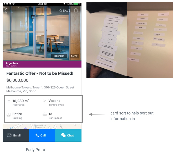
Important information should sit higher up on the page to help users make a quick decision.
From testing, I validated that important information are preferred to have at the top. I asked users that came in for testing, to do some card sorting. I found that users in buy journey and rent journey prioritise different things. This helps with design decisions on information architecture. Based on these, I proposed we build a PDP with 2 different data hierarchy for buy and rent PDPs.
I also managed to get positive feedback on the sticky CTAs, the “Chat” option was just an idea to test, it didn’t make it into production. However, map view hypothesis was wrong. Users will always open up to a full map if it’s not at least half the size of the screen. Based on this finding, I decided to shrink the map further to save precious real estate.
To cater for the business needs, I also managed to improve the UI for the real estate agents’ cards without compromising the whole experience.
Enquiry Form Design
Enquiry form is part of this project, so that is what I tackled next. The enquiry forms had many required fields, it also has a section for you to choose what your enquiry is about. Unfortunately they are all different. I engaged internal stakeholders and validated this through testing, to see if the new options and terminology made sense.
I also looked at trying to capture more users to register after they have successfully submitted an enquiry. This was done by showing them value proposition at the end and buttons to Create Account or to Sign In. I explored the idea of surfacing the email and password fields straight away, but the delivery team didn’t have the capacity to explore that option.
The new enquiry form addressed the issue of "having too many fields to fill”. It’s structured like an email to make it less daunting and avoid the confusion of who the enquiry form is going to. It also has pre-populated message that they can add to. The enquiry options are now clearer and aligned across web and apps.


